| PDF FILE - CLICK HERE FOR PRINTABLE WORKSHEET |
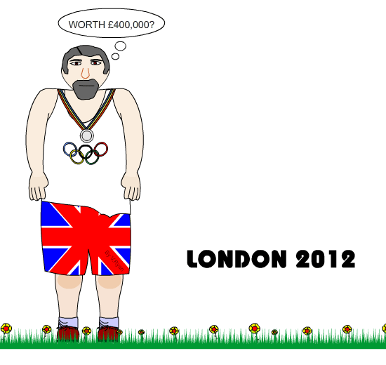
| The official London
Olympics symbol for 2012 is seen below. It cost £400,000 to produce. It is
aimed at younger people and the internet generation. The symbol is based
on the date 2012 and has been stylised as graffiti. The logo/symbol is
available in blue, pink, green and orange. Lord Coe, chairman of the London Games organising committee , said the new logo was "edgy" and appeared to suggest it was designed to provoke a strong reaction. Tony Blair raised hopes that the symbol would leave people "inspired to make a positive change in their life" while Jacques Rogge, president of the International Olympic Committee, praised it as a "truly innovative brand" that would appeal to the young. |
 |
| What do you think of the logo/symbol? |
| COLOUR SCHEME: |
| GRAFFITI STYLE: |
| GENERAL THOUGHTS: |
| DO YOU THINK THE LOGO/SYMBOL IS WORTH £400 000? Explain your answer. |
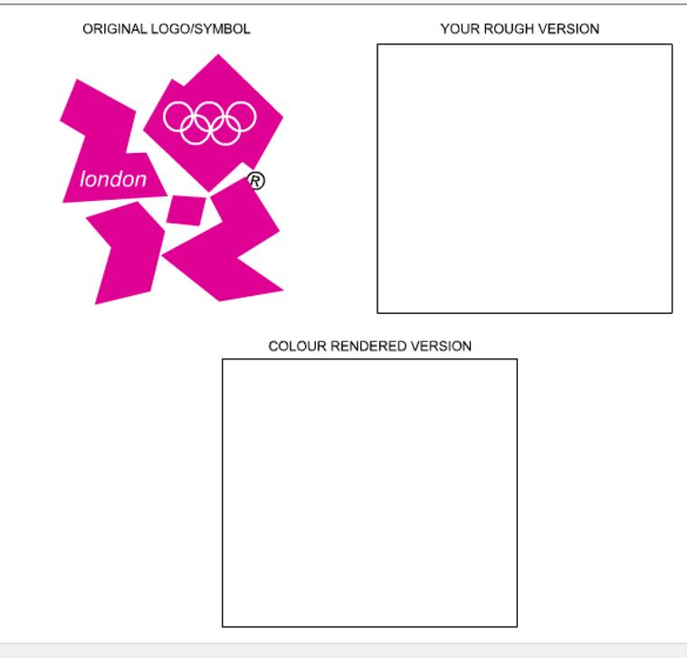
| In the space below explain how you could improve the logo without dramatically changing it: |
| Draw you own improved version of the logo/symbol. Produce a rough version followed by a colour rendered version. |
 |
| CLICK HERE FOR DESIGN PROCESS INDEX PAGE |