|
Below are a number of symbols often seen on packaging. Each has a specific meaning. The symbols are normally very simple and easy to understand. |
|
| PDF FILE - CLICK HERE FOR ANOTHER PRINTABLE SYMBOLS EXERCISE | |
|
|
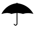
This symbol reminds those handling the package to keep out of the rain and not to store it in damp conditions. it is normally found on card based packages which would be damaged if placed in contact with water. |
|
|
|
|
|
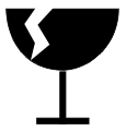
The broken wine glass suggests that the product inside the packaging could be easily damaged if dropped or handled without care and attention. The contents are fragile ! |
|
|
|
|
|
The two hands holding or protecting the package is another reminder that the contents should be handled with care. |
|
|
The symbol seen opposite tells those handling the package that it must be stored the right way up. The arrows point towards the top of the package. |
|
|
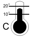
The symbol showing the thermometer is found mainly on packages containing food and drink. The symbol clearly shows that the contents should be stored at a temperature between 10 and 20 degrees (centigrade). |
|
|
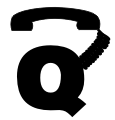
The telephone attached to the letter ‘Q’ means that if you are not happy with the quality of the product/package contents, you can ring a customer services number. This is normally placed very close to the symbol. |
|
|
Customer satisfaction symbol. Seen on some packaging to indicate a satisfaction statement eg. “This product has been prepared for your enjoyment. If you are not completely satisfied please return the product and its packaging to ......” |
|
|
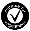
The vegetarian symbol has a ‘tick’ in its centre. This means that the contents are suitable for vegetarians to eat. |
|
|
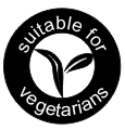
This is an alternative vegetarian symbol. In place of a ‘tick’ in its centre it has a symbol that represents leafs. This means that the contents are suitable for vegetarians to eat. |
|
|
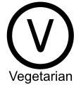
Another alternative ‘suitable for vegetarians’ symbol. |
|
|
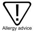
This symbol suggests that the consumer should be aware that the product could contain wheat, gluten, sulphites, traces of nut or it has been made in a factory that uses nut ingredients. |
|
|
The ‘gluten free’ symbol means that the product inside the packaging does not contain wheat extracts. Some people are sensitive or even allergic to such extracts. Therefore, clear labelling is required. |
|
|
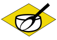
Ingredients symbol. This is often placed alongside the list of ingredients. It represents a mixing bowl an spoon, with a colourful background to highlight the black and white foreground. |
 |
The Ecolable is a scheme managed by the European Union. It was established in 1992 and aims to promote products and services that are environmentally friendly. Companies and businesses that use this symbol / label have shown consistently, that they sell products and services ,that conserve the environment. For instance, a company that has reduced its carbon footprint can apply to use the ecolabel. A company that uses recycled materials in the manufacturing of its products or encourages recycling can also apply to use the symbol. |
|
QUESTIONS: 1. Design your own symbol for the following themes: A. Contents not suitable for vegetarians. B. Sharp edges on product inside packaging. C. Contents not suitable for children under 5 years of age. |
|
| CLICK HERE FOR GRAPHICS INDEX PAGE | |
| CLICK HERE FOR RESISTANT MATERIALS INDEX PAGE | |
|
|
|