| PDF FILE - CLICK HERE FOR PRINTABLE WORKSHEET | |
| QUESTIONS | |
| The promotional packaging you design must have the following design features: | |
| Explain why the packaging should be sustainable. | |
| Explain why it would be an advantage for the packaging to be educational. | |
| Explain why the use of colour and images on promotional packaging, is an important design feature. | |
| The packaging should allow ease of stacking on a supermarket shelf and during transport. | |
| The packaging should promote a healthy diet. | |
| POSSIBLE ANSWERS | |
| Explain why the packaging should be sustainable. | |
|
It should be possible for packaging to be recycled, so that new materials
are not needed, minimising environmental damage. Further to this, reducing
the amount of packaging helps protects the environment. Reusing packaging
should also be considered, by designers. It is important that the box quality card is sourced from companies that use sustainable forests. This means that for every tree felled for the production of the card, another tree is planted. |
|
| Explain why it would be an advantage for the packaging to be educational. | |
|
Packaging that encourages a healthy lifestyle, could also be used to
promote a product and engage the customers interest. Packaging with an
educational content adds value to the product. It means that the customer
will learn something from the information on the packaging. Interesting,
educational packaging will enhance the overall customer experience of the
product. Manufacturers have moral and ethical reasons to promote their products in a sensible and responsible manner. Adding educational content to the packaging ensures that this happens. |
|
| Explain why the use of colour and images on promotional packaging, is an important design feature. | |
|
The selection and use of images and colour helps to promote a product.
Research shows that young children are attracted to bright colours,
whereas adults are generally attracted to a blend of more subtle colours. Images and colour help to create the customers understanding of the product inside. They build a picture of the product, developing interest and potential sales. |
|
| The packaging should allow ease of stacking on a supermarket shelf and during transport. | |
| Packaging is normally designed so that the product and its packaging can be stacked safely, minimising space. This means that a high number can be stacked on shelves in a supermarket, with the most important information facing the potential customer. Furthermore, a well designed package will allow for ease of transport. The packaging with the product inside, should stack tightly in a standard brown box, which can then be stack in a container / lorry, minimising wasted space. | |
| The packaging should promote a healthy diet. | |
| Today potential customers tend to have an understanding of the link between diet and health. The packaging should clearly state the health benefits / negatives of the food product inside. This allows the potential customer to make an informed decision about the possible purchase. | |
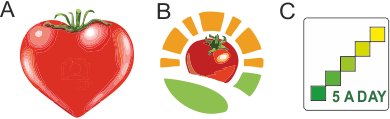 |
Healthy eating symbols, ‘pressed into the polypropylene casing. Symbol ‘A’ is promotes foods related to a healthy heart. Symbol ’B’ relates to eating fruit and vegetables. Symbol C promotes the ‘5 A Day’ campaign. |
| CLICK HERE FOR PRODUCT DESIGN INDEX PAGE | |