![]()
|
|
V. Ryan © 2002
|
A company LOGO is very important as it is a symbol of
success. Successful companies such as Microsoft, Nike, Reebok and many
others rely on a logo to put over an image of achievement to the general
public. If you log on to almost any website you will see a logo of some
form representing the person or company responsible for the site. It is
more than likely that in the past you have designed a logo or a badge to
represent yourself and the type of person you are. |
|
|
|
Unfortunately there are no awards for recognising this logo - possibly the most famous in the world. The logo states clearly what it represents, a drink (the bottle) and the company that makes it (CocaCola). The message is clear and simple. The drawing may be simple but there is still detail. The logo looks ‘cool’ as there appears to be ice droplets forming on the outside of the logo. The logo is inviting you to buy the product and have a cold , refreshing drink. |
|
|
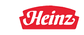
“Heinz means beans”, says the old slogan presented by Heinz to sell beans. The logo itself tells us very little about the product but to the older generation brought up knowing the quality beans produced by Heinz, immediately recognise the name - and assume quality. The original logo was developed many years ago but people still associate good quality products with it. The company Heinz have been very careful not to alter a famous logo although they have altered the taste of existing products and introduced new ones. Heinz are a respected and trusted company and consequently the company name stands out on the logo. |
|
|
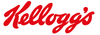
Kellogg’s is another famous and well respected food company. When you buy a product from this company you expect quality and taste. The logo simply represents the name of the company, it is easy to spot and read. the logo has changed little for many years. |
|
|
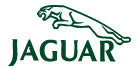
Would you buy a Jaguar car ? I would if I could afford one. Again, the logo is simple and easy to understand. Jaguar is a very well known make of sporty cars and the logo expresses this by the addition of a ‘jaguar’ leaping across the company name. The leaping jaguar represents power and strength. |
|
|
The McDonald’s logo is one of the most easily recognised in the world. The large ‘M’ is displayed outside every McDonald’s and on almost all their packaging. If you see this sign outside a café/restaurant you know what can be purchased inside. McDonald’s have associated the large ‘M’ successfully with the product they sell. |
|
|
‘Vodafone’ are one of the top telecommunications companies in the world. They specialise in mobile phones. Their logo is very clever as it is clear and easy to understand. The logo is a simple quotation mark inside a circle. A quotation mark is used to start and finish a quotation in writing. The colour is read and white - is this why Vodafone sponsor the most profitable soccer club in the world (Manchester United)? |
|
|
|
|
BASIC RULES FOR A SUCCESSFUL LOGO |
|
|
1. A successful
logo is usually very simple in design. |
|
|
1. Draw three
well known logos and explain the words, shapes and colours that are
used. |
|
|
|
|