CLICK HERE FOR INDEX PAGE

HOW TO CARRY OUT A QUESTIONNAIRE

Questionnaires, Statistics and Pictograms

V. Ryan © 2001-2017

 
PDF FILE - PRINTABLE GRAPHICS / PICTOGRAM QUESTIONS
 
PDF FILE - CLICK HERE FOR PRINTABLE QUESTIONNAIRE SHEETS
 
YouTube Video - Drawing Pictorial Graphs (Pictograms)
 

What is a Questionnaire ?


A very important aspect of research work is a survey or questionnaire. Marketing companies regularly carry out surveys / questionnaires, on behalf of manufacturers who are developing new products or aiming to improve existing products. When working on your project, a questionnaire will show the examiner that you have produced individual research relating directly to the product you are designing.

A questionnaire is usually composed of one or more questions, answered by a number of people normally called potential clients or the target market. The results can be collected as a table of results and/or a graph or pictogram.

Questionnaires will help you design a product, because they may tell you what the market wants. (What people are prepared to buy).

Also, questionnaires regularly appear on examination papers. Examination questions normally give a table of results from a questionnaire and you are asked to convert the ‘written’ results into a graphical form of presentation (often called a pictogram).

TABLE OF RESULTS

EXAMPLE

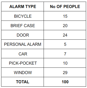
If you are designing an alarm system, you need to know what type of alarms people want to buy. You could carry out a survey based on the following question and store the results as a table:

I asked 100 people, which type of alarm they were in most need of ?

Bicycle, brief case, door, personal, car, anti pick pocket or window.

The results are first presented as a table of results and then as a graphical pictogram.

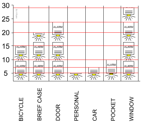
The Table of Results is a plain table, whilst the pictogram should include graphics / images. The pictogram below is built up of alarm boxes, in place of ‘bars’ in a bar chart.


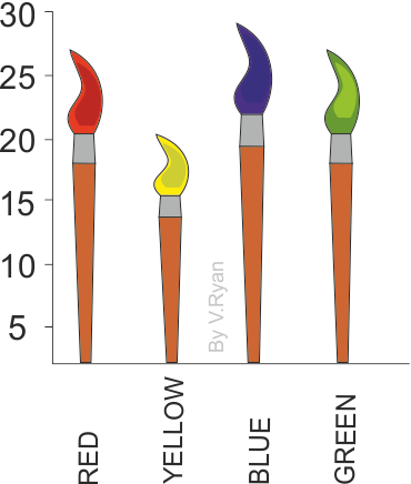
Pictograms can be an interesting visual component of research work. They give the opportunity to show how plain statistics can be presented in an interesting manner. The pictures/images in a pictogram should reflect the question that has been asked. For example, if you are trying to find the most popular colour of paint, the statistics could be presented as paint brushes, in a pictogram.
   
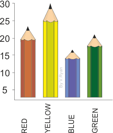
The pictogram opposite has been drawn to represent the most popular colour, from a limited selection of red, yellow, light blue and green.

Coloured pencils have been drawn to produce a graphical representation of the questionnaire / survey results.

Other images could have been used including, paint pots, paint brushes and spray cans.
   
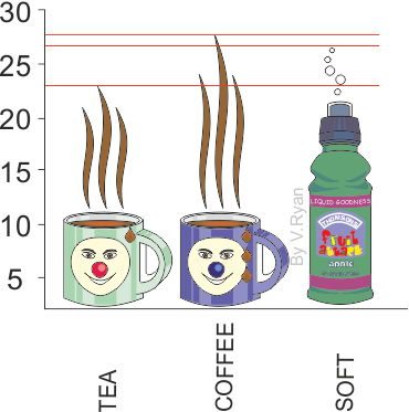
This pictogram has been drawn to represent the findings of a survey, which asked people to choose between tea, coffee or a soft drink, as their favourite break time beverage.

The steam rising from the tea and coffee indicates the popularity o each drink. The bubbles coming from the top of the soft drink, indicates its popularity.
 

Carry out a questionnaire for a project of your choice. Select the question(s) you are to ask carefully and decide on the range of people that you are going to approach (teenagers or adults over 20Years of age etc...).

FURTHER INFORMATION
   

The example shown below is a basic example of a questionnaire sheet.
1. At the top of the sheet a clear statement should be made regarding what questions or question has been asked.
2. The target population should be identified. The example sheet shows that teenagers aged 13 to 19 years of age were asked the question. The number of people asked is also stated.
3. Draw a table of results. Consider including a key that states the number of people represented by each. On the example the key is at the top (1 UNIT = FIVE PEOPLE). Alternatively, create a table that has two columns. In one column write the choices and in the other write the number of people who selected each one.
4. Write as many possible choices for your question(s) and shade the appropriate number of boxes or place a tick of cross in each.
5. Draw a pictogram or bar chart opposite the table of results. If you choose to draw a pictogram, use pictures that represent the theme. For example, if the questionnaire is about musical instruments, then musical notes could be used for the pictures. In the pictogram seen opposite, arrows are used to represent each column of figures. However, the pictogram represents alarms, what could be drawn in the place of arrows?
6. Place a scale alongside the pictogram so that the figures can be read easily.
7. If you have difficulty drawing a pictogram produce a bar chart or line graph.
8. Write a summary of your findings at the bottom of the page. This should clearly say what you have learnt from the answers to the questionnaire.


SUGGESTIONS

   
A. Take time when thinking of a question or questions that you intend to ask. Keep questions simple.
B. When writing your questions keep in mind the target population especially the age group concerned.
C. Look at examples of pictograms and tables as these will give you ideas for your page layout.
D. Complete your homework on time. Do not fall behind as you may find it impossible to catch up.
   
LESSON STARTER - QUESTIONNAIRE
   
CLICK HERE FOR SAMPLE QUESTIONNAIRE QUESTIONS AND TARGET MARKETS
   

CLICK HERE FOR EXAMPLE QUESTIONNAIRES

   
CLICK HERE FOR DESIGN PROCESS INDEX PAGE
 
CLICK HERE FOR GRAPHICS INDEX PAGE
   
 
Google
 
Web www.technologystudent.com