| PDF FILE - CLICK HERE FOR PRINTABLE WORKSHEET | |
|
The next time you are in a supermarket, list the main colours on packages of everyday goods. You will probably find that primary colours, are the most common. Extensive scientific research, shows that strong bold colours / primary colours, are used to attract a mass market. |
|
|
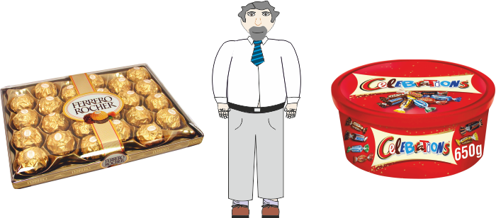
Sophisticated products such as expensive chocolates, often have shades of blue and black or even gold, on their packaging. The printing on the packaging is usually gold / silver. It is believed that these colours make the package look more expensive and ‘up-market’. They give the illusion, that the chocolates inside the package, are quality chocolates. The person below, is trying to decide which chocolates he should buy for his mother, on Mother’s Day. The more expensive box or the cheaper one? Which is the cheaper of the two boxes of chocolates? |
|
 |
|
|
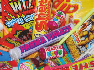
Research shows that young children are attracted to sweet packages, that have bright colours (bright reds and yellows). Apparently, older people are attracted towards more subtle colours (shades of blue). Next time you are in a supermarket, watch the young children with their parents. When they select sweets, look at the colours on the package. Are they bright or dull? |
 |
|
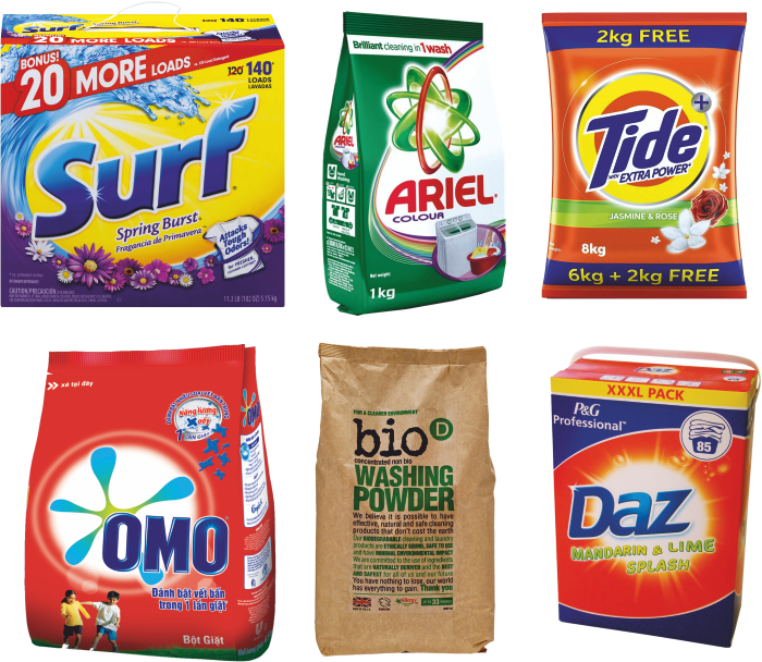
Study washing powder / liquid packaging. The colours applied to the packaging reflects ‘freshness’. In this way, blues (representing water) and greens (representing a healthy environment) are dominant. Whatever the age of the shopper, he/she expects certain colours on certain types of product. When you design a package, it may be too risky to use the colours, that are not associated with the product you are packaging. |
|
 |
|
|
|
|