|
PDF FILE - CLICK HERE FOR PRINTABLE EXERCISE BASED ON WORK BELOW |
|
|
The symbols / images below have been produced by looking at photographs of sports people and then simplifying the images by reducing each one to a basic drawing. Patterns have been added to give the illusion of movement or speed. Again a limited amount of colours have been used. |
|
|
|
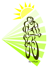
The symbol / image on the right is a cyclist. The
outline gives just the right amount of detail so that a cyclist stands
out. What does the image suggest to you? |
|
|
|
|
|
|
|
|
|
|
|
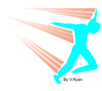
The image opposite is that of a sprinter / runner
crossing the finish line. The outline of the runner has been simplified
and only one colour has been used. |
| What does the image suggest to you? | |
|
QUESTIONS: Select a
range of images / symbols from products of your choice that you find
impressive. Cut out each image and glue them on a piece of paper.
Alongside each, describe what they suggest to you in terms of feelings
and the atmosphere they create. |
|
| CLICK HERE FOR GRAPHICS INDEX PAGE | |
|
|
|