CREATING A SAFETY SYMBOL
V. Ryan © 2006 - 2021
| PDF FILE - CLICK HERE FOR PRINTABLE VERSION OF EXERCISE SHOWN BELOW | ||||||
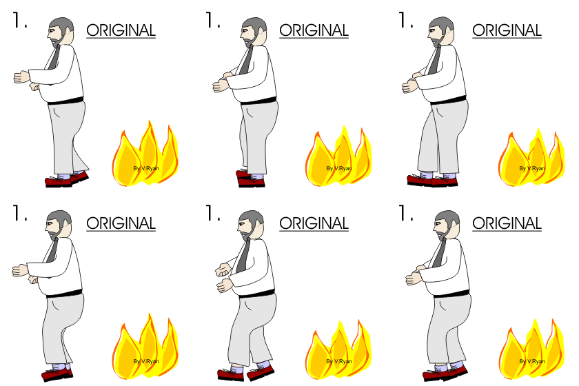
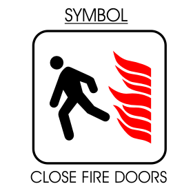
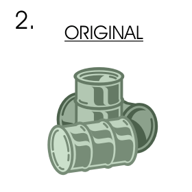
| You are to create your own safety symbols by converting pictures into simpler versions. The basic rule is to simplify a picture/pictures, removing detail so that only an outline is left. The outline of the symbol should be smooth and flow. The symbol must be recognised at a glance. In example 1 two detailed pictures have been simplified to give a final safety symbol. This symbol has been designed to remind people to close fire doors. Complete questions 2 and 3. Remember to select your colours very carefully and limit yourself to two or three shades / colours. | ||||||
 |
 |
|||||
| The picture of the runner and the fire have been combined to produce a symbol aimed at reminding people to close fire doors. Do you think it is an effective / recognisable symbol? Explain your answer. | ||||||
 |
 |
|||||
| Do you think your symbol is easy to understand? Could it be improved in anyway? | ||||||
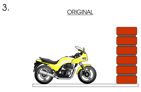
| Each year many people (especially young people) are killed whilst speeding on a motorbike. Look carefully at the picture of the motor bike and brick wall. Convert these detailed images into a symbol that could be used on posters and bill boards to remind young bike riders to slow down and to take care. | ||||||
 |
||||||
 |
||||||
| Do you think that your design is likely to be noticed by young motorbike riders? Will they understand its message? | ||||||
|