| PDF FILE - CLICK HERE FOR PRINTABLE WORKSHEET |
|
In typography, TYPEFACES are often referred to as FONTS, although this is
not entirely accurate. A typeface includes letters, numbers, symbols and
punctuation marks. The term typeface refers to the type of lettering selected such as ‘ARIEL’. Font refers to the style applied to the typeface such as, italic, bold, subscript, superscript or underlined |
| A typeface is selected very carefully and this often depends on the product and the potential customer. For instance, a road sign needs to be easy to read at a distance and at a glance, when driving. Consequently, the typeface ‘Transport Medium’ is used for traffic signs in the UK. |
| Study the four typefaces below. Which one is the most suitable for a child’s learning clock? |
| NAME: ______________________________________________ |
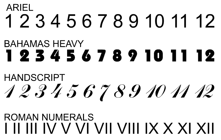 |
| In your opinion, why is your selected typeface the most suitable? |
| PLAIN - BOLD - CLEAR - AT A GLANCE - EASY TO READ |
| Which typeface is the least suitable for a child’s learning clock? |
| NAME: _____________________________________________________________ |
| In your opinion, why is your selected typeface the least suitable? |
| COMPLICATED - ORNATE - DIFFICULT TO INTERPRET - UNCOMMON |
| CLICK HERE FOR GRAPHICS INDEX PAGE |