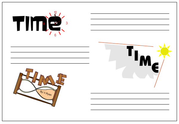
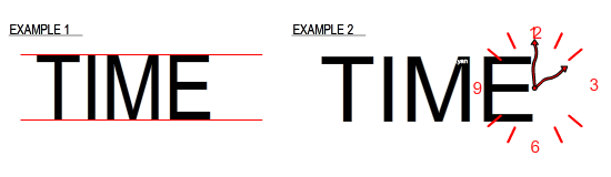
The word TIME can be written in a very basic accurate way as seen in example 1. However, the word is more eye-catching and meaningful if the style of lettering / font represents the true meaning of the word. Compare example 1 and 2. Which is the more artistic and imaginative ways of presenting the word time? explain your answer.
PDF FILE - CLICK HERE FOR PRINTABLE VERSION OF EXERCISE BELOW
The word time is then placed with the individual letters resting on the tilted side. Each letter is written in a simple but effective style. Sand timers normally have a wooden case that holds the glass securely. This why the style of lettering is based on a wood effect.
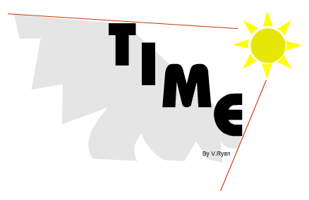
Yellow has been used to reflect the heat and brightness of the sun whilst the grey of the lettering represents the shadow cast by the lettering.
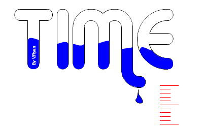
The writing style opposite reflect the use of water in time keeping. Water is seen inside the ‘glass’ word. The dripping water is time seeping away.
Choose your best design and draw a coloured rendered version. Explain why you consider it as your best design. An example of the layout is seen below.